Peter Prolapse
18/11/2026
95
60
1
Cartoon doritos idea is TM by Szafranko corporation.. but doritos themselves are owned by dorito's company..
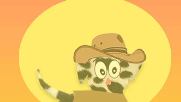
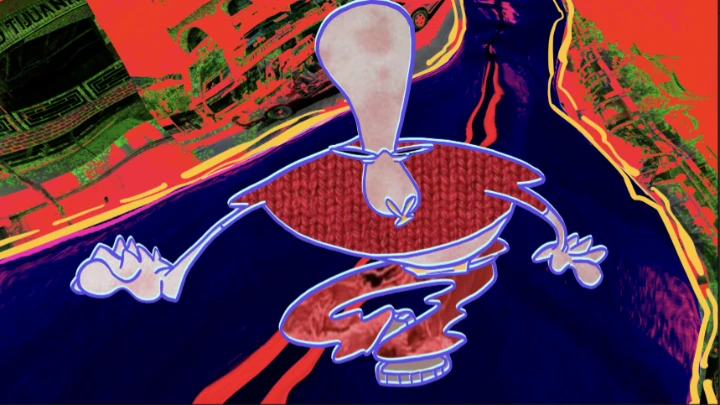
This being my first real animation i have sent i doubt this would be any good as i have reviewed many animations and all the first ones are never that good so i ask you to read this before and after you watch the animation in hope to give helpful criticism along with that i would like the peoples opinion on what the characters should look like since i would like to stay with the Doritos idea
This isn't my final copy of this movie i actually wanted it to be longer, with better audio and a kitchen setting as a background but i didn't want to put alot of effort into somthing that i havn't finished deciding on what characters are to look like..
So... below is a list i'd like you to decide in your reviews on the change of character design if that isn't too much to ask
Eyes
1. keep eyes like in movie.. ( black dots )
2. Classic cartoon eyes ( black dot surrounded by white and then a black outline around the eye )
3. other ( give your own opinion )
Body
1. Thin outline around body boarder
2. average outline around body boarder
3. thick outline around body boarder
hands
1. keep with 3 fingers
2. five fingers
arms/legs
1. no joints just cartoony wavy arms
2. bone joints
nose
1. Nose?.
2. or no nose
Mouth
1. teeth
2. teeth and tung ( I'm not quite sure how to spell that..)
3.lips?
4. combination / other ( come up with own idea )
and if theres anythign else you guys woudl like to change or improve on.. just say so and i'll consider it i wont go by majority on these votes i'll go by which set i like the best.. :) thanks for the help and hope you enjoy this